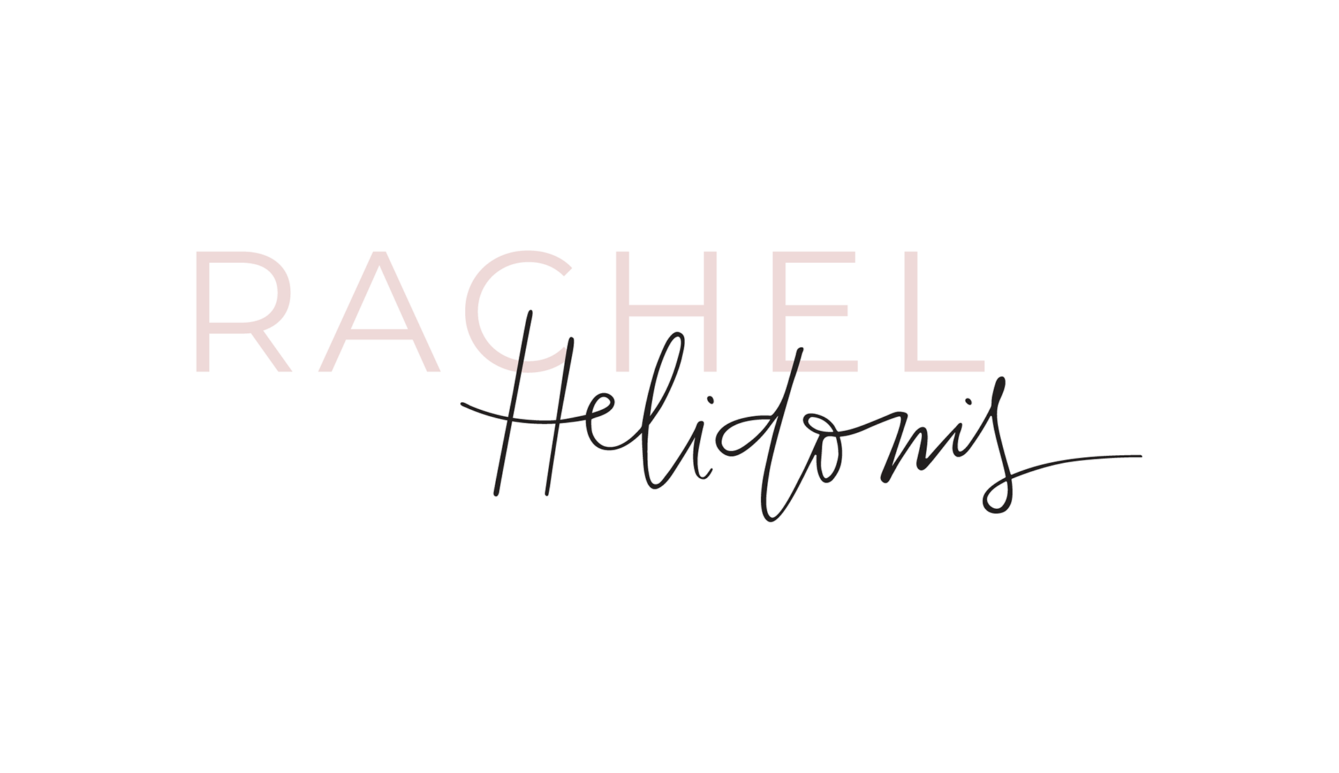
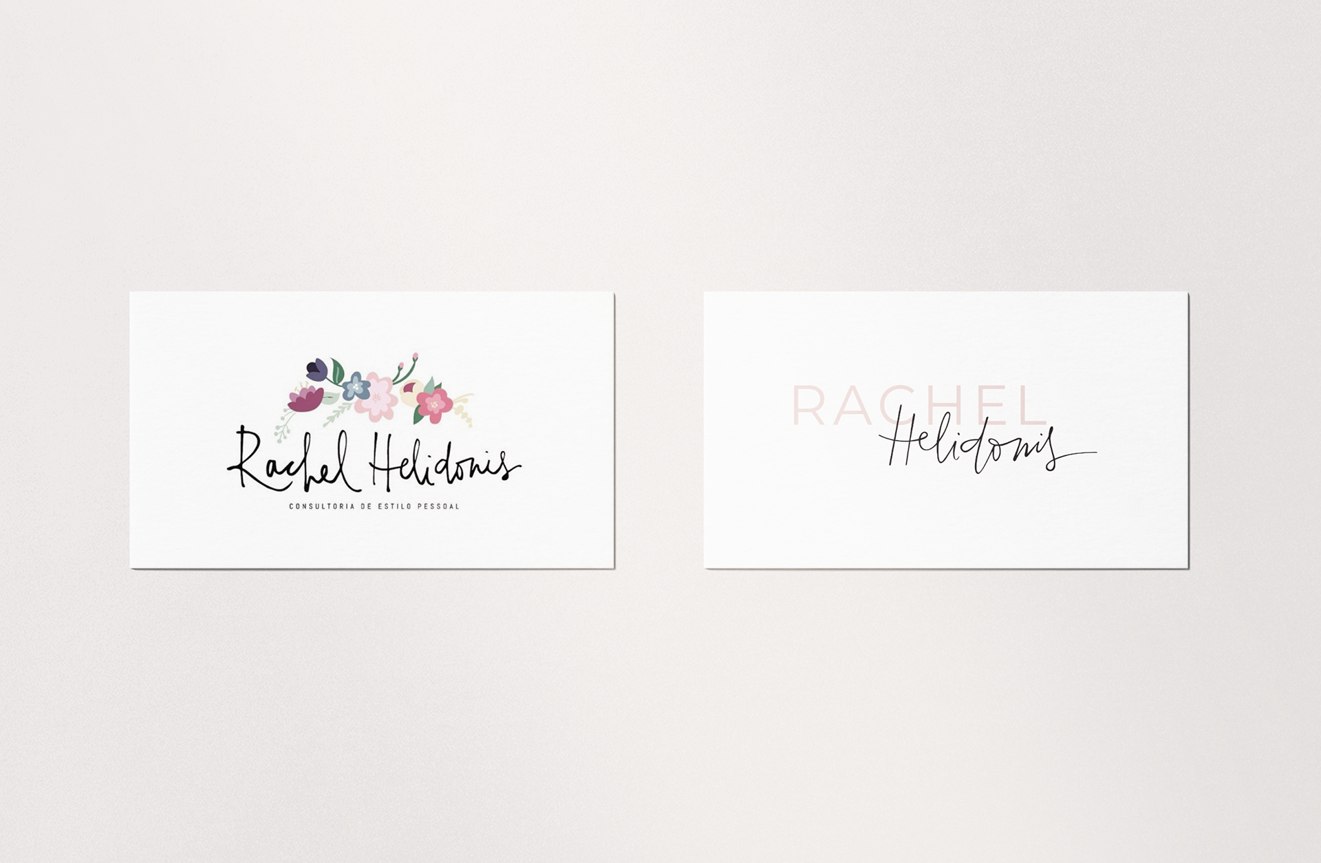
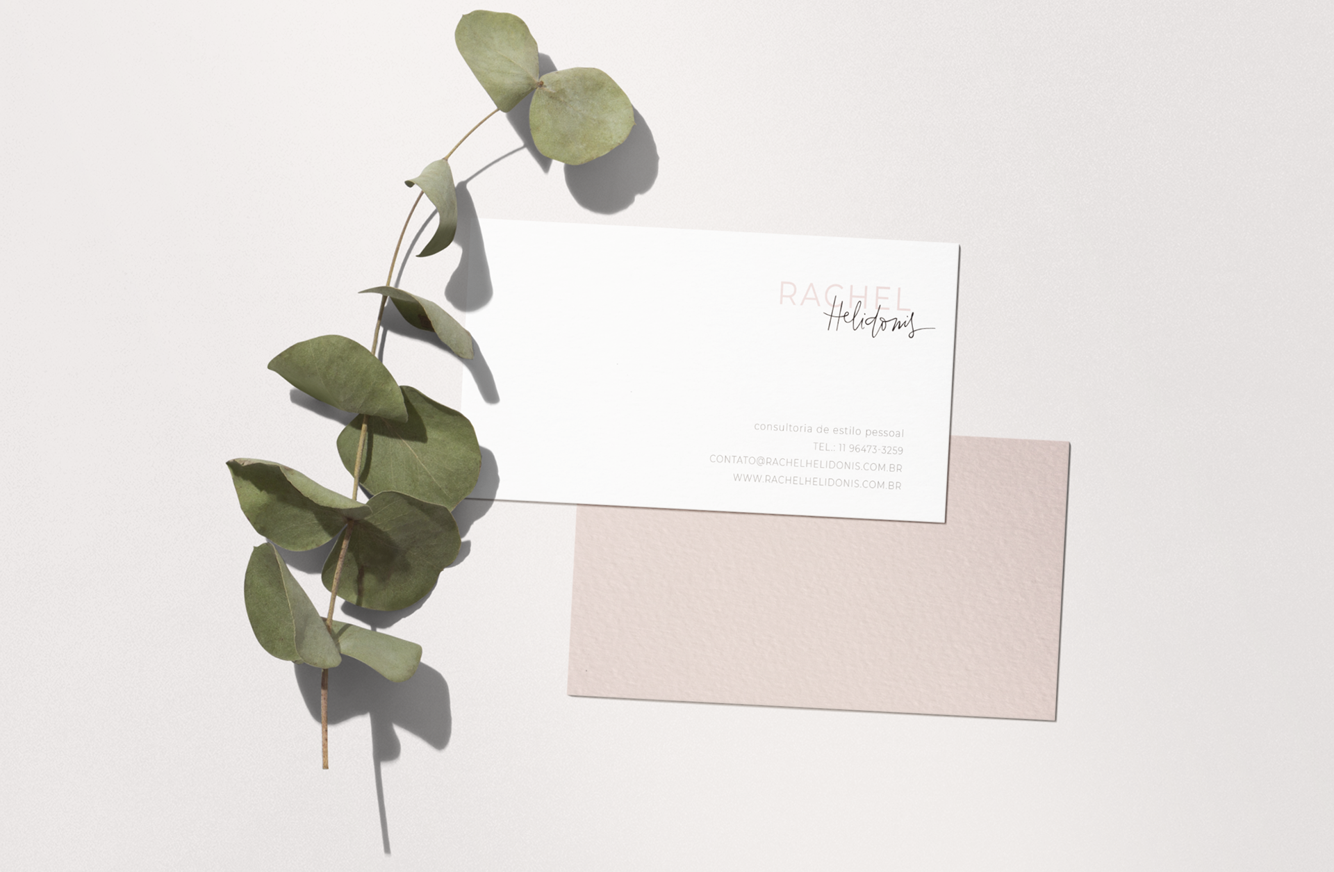
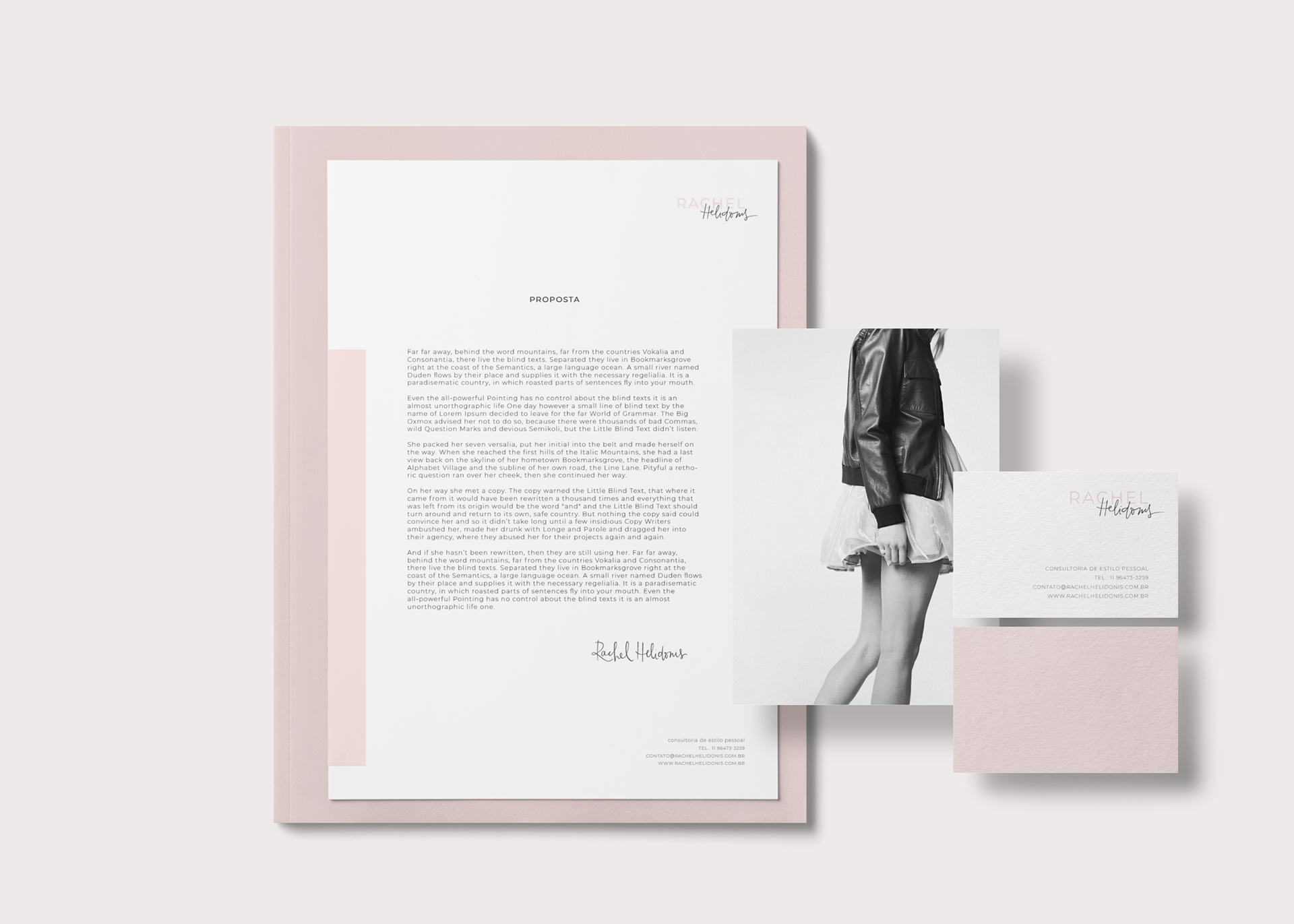
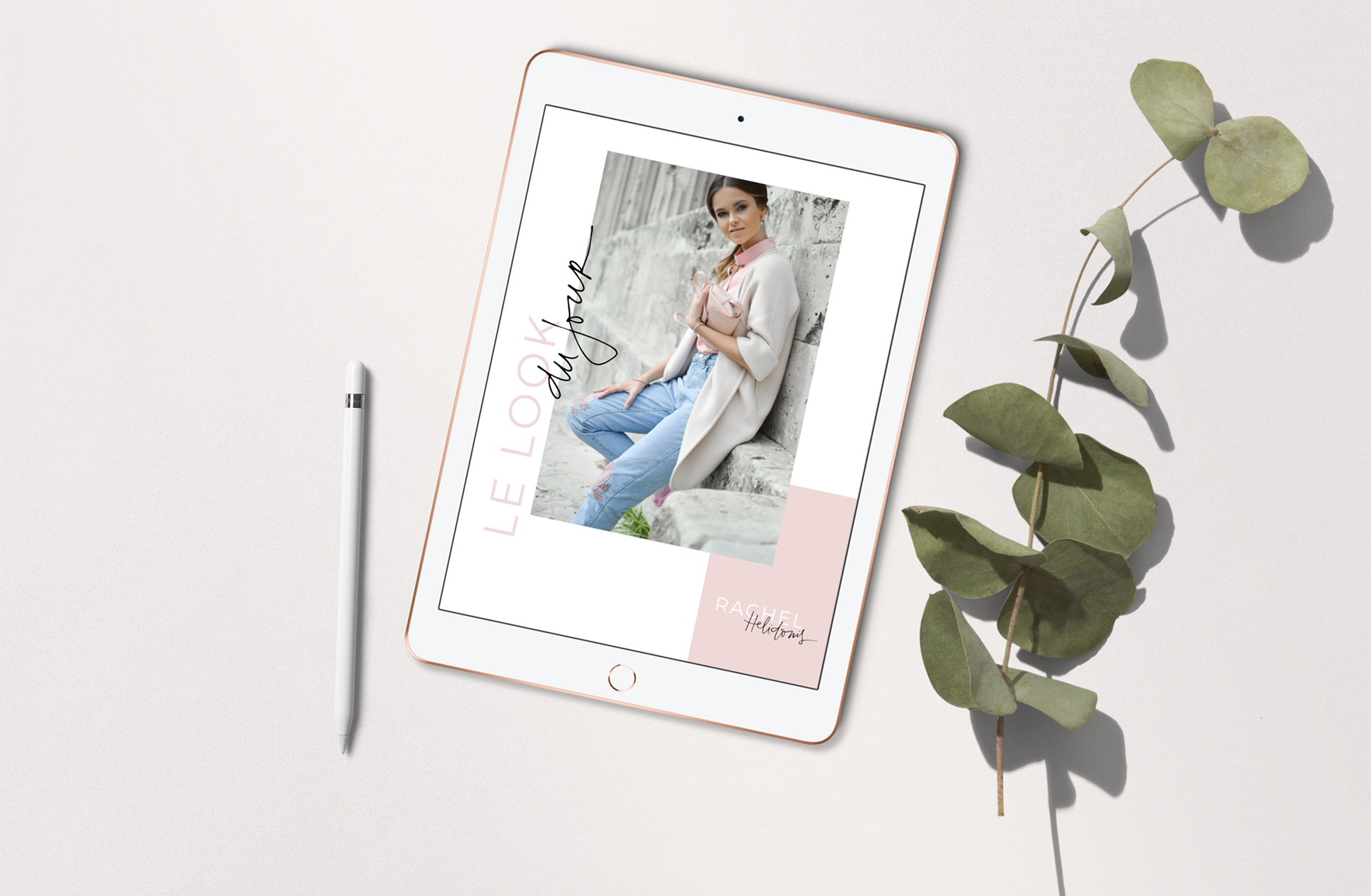
After eight years, the old logo no longer matched Rachel's identity. Gaining experience in work and life shapes and transforms us. It was a blissful project, and she was such a delight to work with again and again. The new approach, much cleaner, and lighter, reflects her personality. Combing font and handwriting, I could bring the strength and smoothness present in her work. It is the combination of the straight, with the curved. A lovely and balanced result.